Check out what you no-code with our latest plugin you can find in our Directual marketplace! Pie charts, line charts, bar charts, everything charts—now a part of the platform.
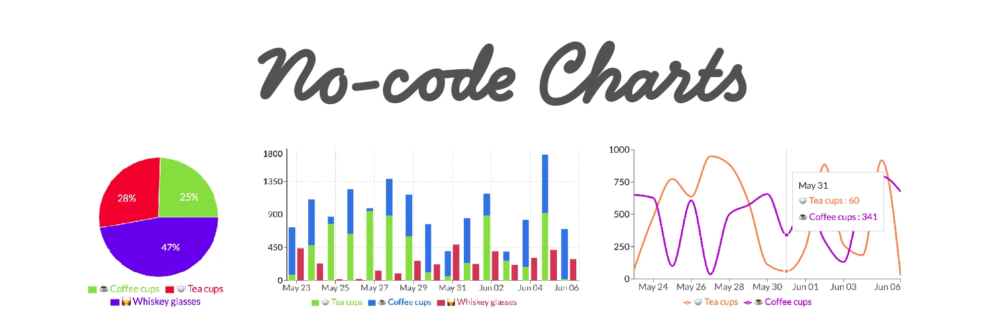
For any no-code business working with large swathes of data, it’s a no-brainer that it must be properly visualized. Otherwise, what’s the point in having all these insights if you must use ridiculous Excel pie charts to make sense of them?
This short article will explain how you can easily utilize the Graphs plugin (now available on Directual Marketplace) and breathe life into your insightful dashboards.
Your bread & butter of the graph industry. Here’s what you can expect out of line and area charts in Directual:
On top of that, you can have the legend displayed, along with the grid and tooltips.
The best part, however, is that you can alter the X and Y axis scale.
For instance, if you have time periods in your dataset that are not equal, the graph can adapt to it and display said periods accurately. In this case, you should select “time” in the Scale options. Also, you can decide if you want to connect data points on the graph with a straight line, curved line, or steps.
The graph lines, of course, are fully configurable. Each and every single one of them can be manually adjusted—there are special configuration fields for that. Alternatively, you can automatically select as many lines as there are data variations for display available.
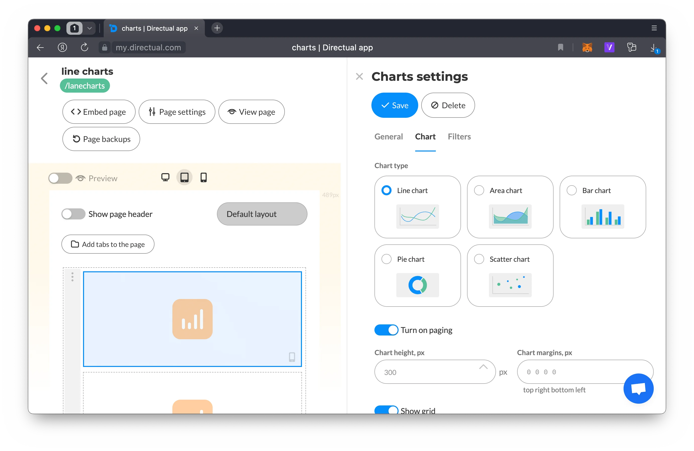
Chart component settings
Another timeless staple of any dashboard.
You can stack data into a single column. Filtering, pagination, and data point markets will also be available for this kind of graph.
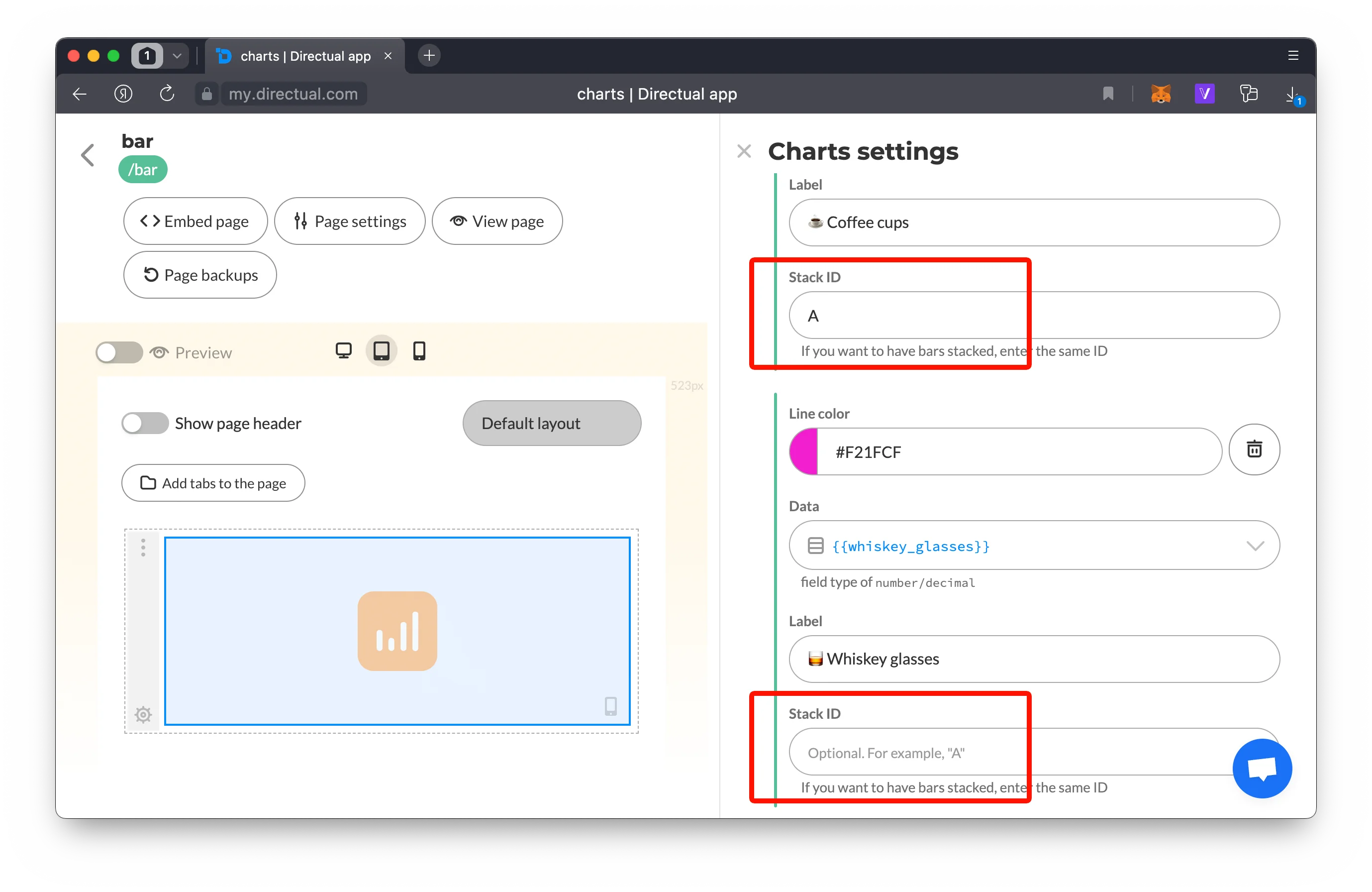
Stacking bar charts settings
If your dataset is rather complicated but the bar chart is still what you want, you can create two-axis charts just as well. How about some vertical bar charts? With not one, but two axes? Piece of cake—see for yourself:
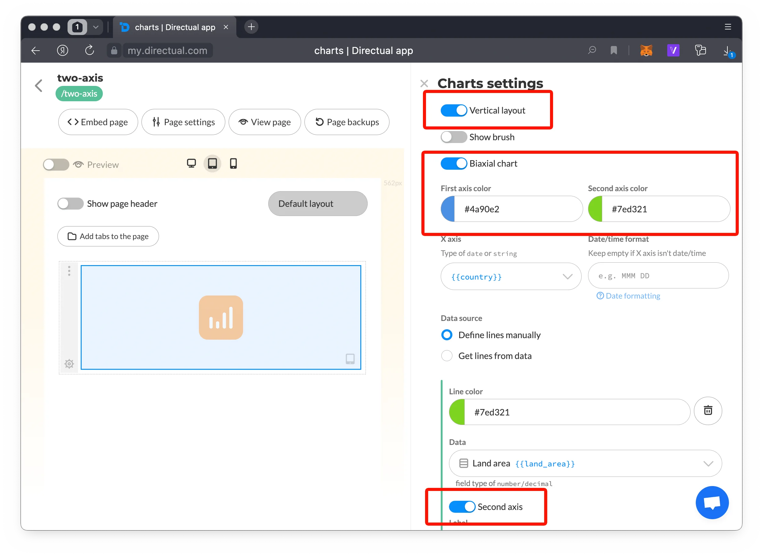
Biaxial vertical chart settings
If you’re into quite complex data charts that require visualization of the relationship between two variables, you got this too. Place your data points on the chart and watch the relationship between them get outlined via its size.
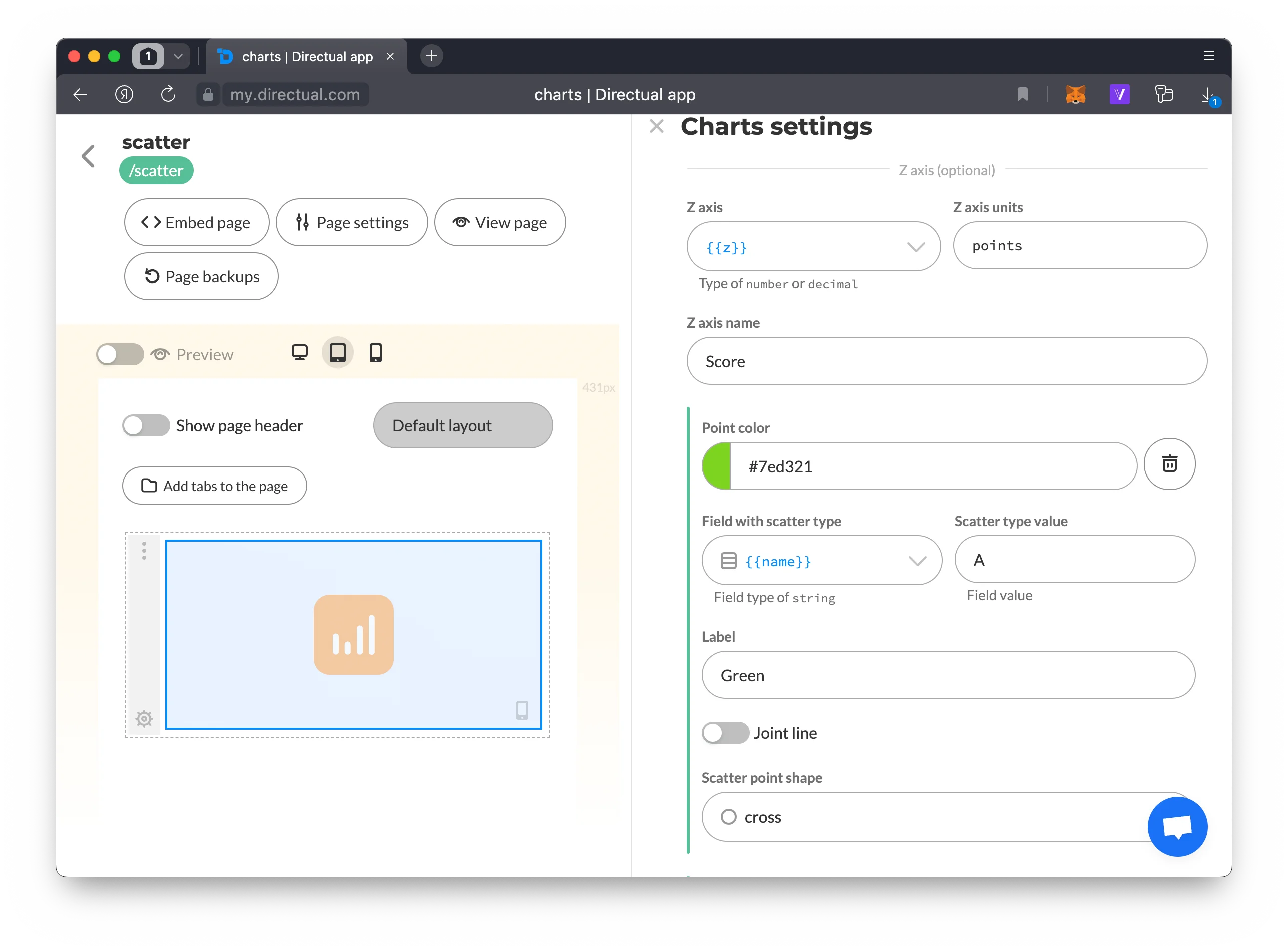
Scatter chart settings
Have your pie and eat it too. This chart type includes two key options you’ll like:
No need to ask—you can set up the graph thoroughly as well. Configure radius size, determine if you want half the pie or the whole thing, along with the display of the legend, labels, and percentages.
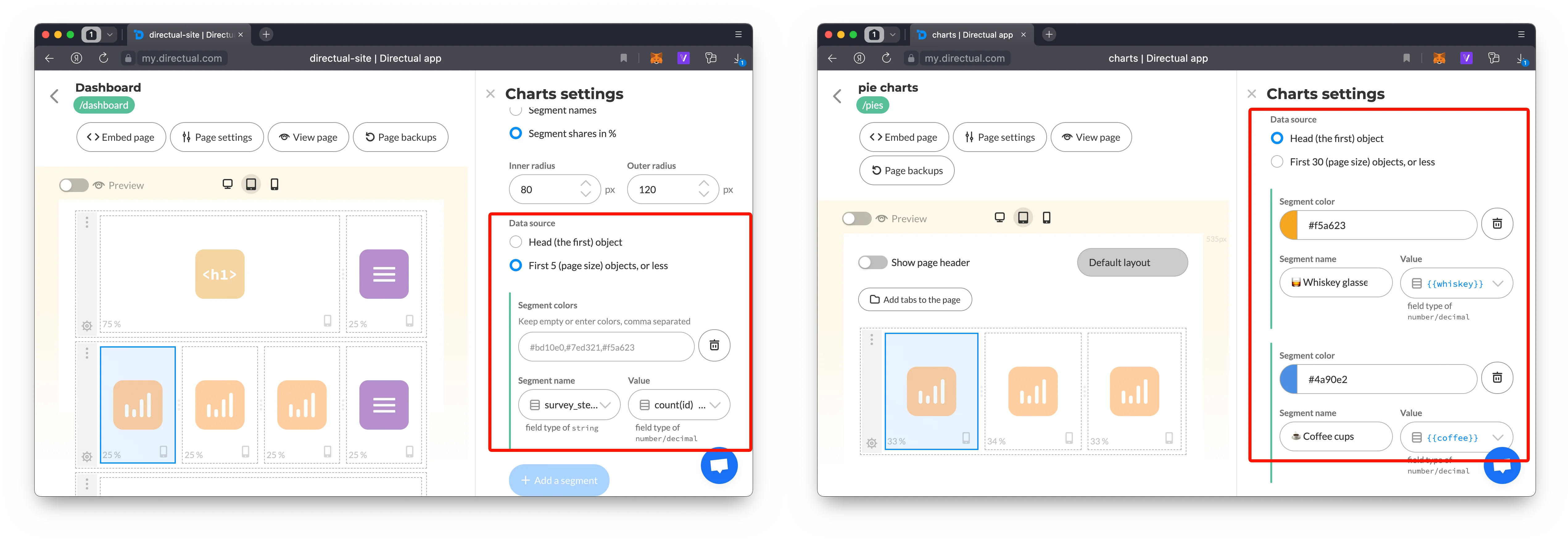
Dynamic segments (left) and fixed segments from the first object (right)
If you’re into some transparent polling, like we are, you can create complex dynamic filters and use sockets to update the graph!
Some backstage business for you: here’s how our New user poll results are displayed within the platform:
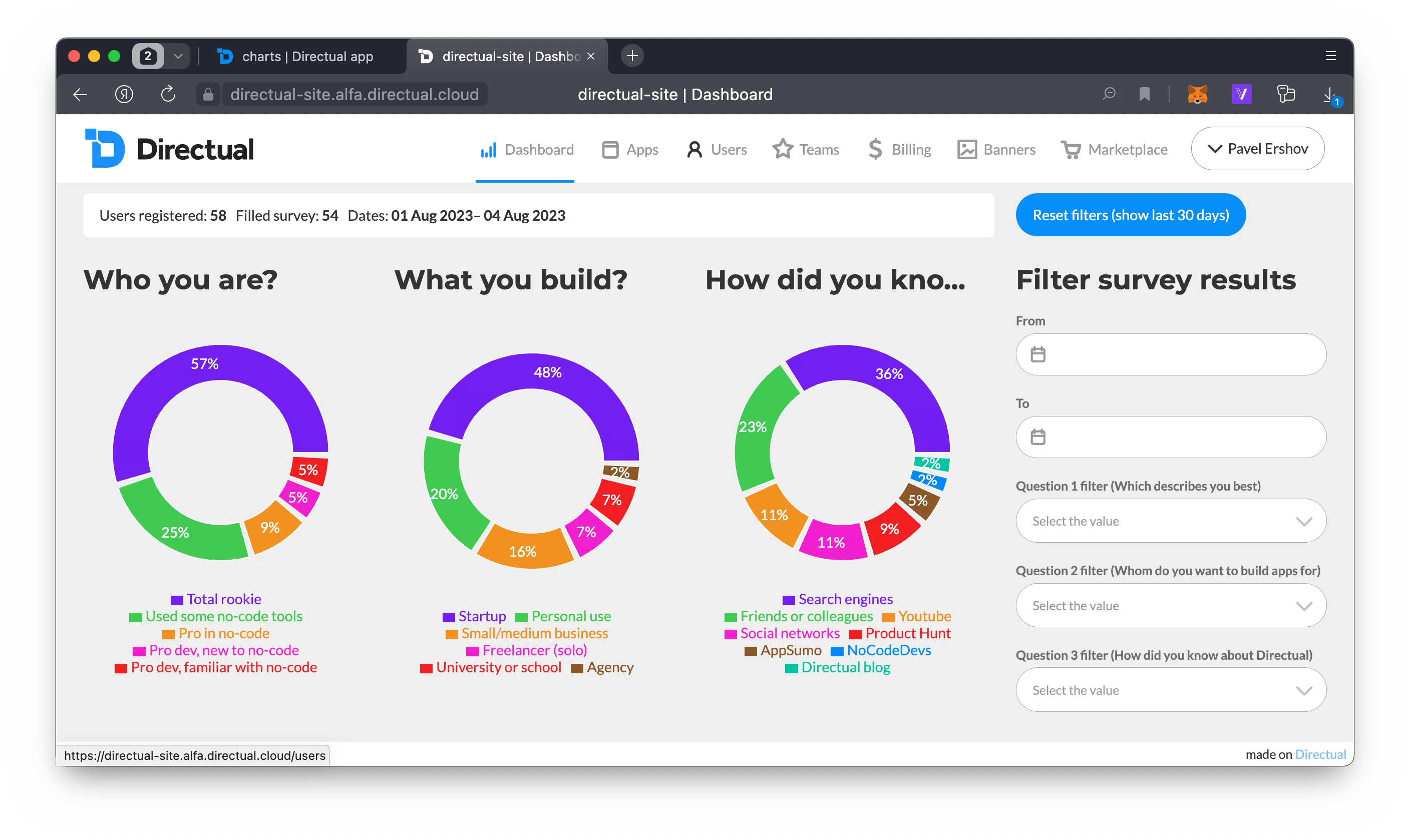
Directual dashboard
What you see here right now is just the beginning of the Graphs plugin. You’ve been asking for it since the beginning of time, and we aim to continue to deliver. If there are things that you’re dying to see, just let us know—by sending a letter to hello@directual.com or heading into one of our communities (links are in the footer below).