

Time to explore the colors of the rainbow! Step away from backend and databases for a bit and learn everything about the powers of color, and how to use them in your projects. A little bonus is waiting for our readers at the end of the article, too.
For many a no-coder, color can be a very tricky thing to unravel. Some things look nice together, some don’t. At a glance, it may seem that there is no structure to it whatsoever!
That is definitely not so. Color theory has been a thing for a longest time, and the user of various colors in combinations predates the earliest Egyptian art. Now, for everyone who finds colors fascinating and looks for a quicker way to achieve balance not just functionality-wise, but aesthetic-wise as well—this is the article to read through. Buckle up, though: it’s a long read.
Let’s dive into the exciting world of color theory straight away. This fascinating subject is all about understanding how colors work together and how we can use them to create visually pleasing designs. Especially when no-code projects are concerned—it’s so rewarding to play with the visual part of your app and master’s brush strokes here and there.

Want to be hip from the very start? Use this color in your project. Pantone’s color of the year 2023—“Viva Magenta”. #BB2649. It is gorgeous, to be fair.
Color is a powerful tool for creating a brand identity. Think about some of the most well-known brands out there. McDonald's is associated with red and yellow, Coca-Cola with red and white, and Starbucks with green. These brands have created strong associations between their colors and their brand identities. When designing a brand identity, it's important to consider the emotional impact of colors and choose colors that support the brand's message.
When designing, you have to consider the emotional impact of the colors you're using. Think about the message you want to convey and choose colors that support that message. For example, if you're no-coding and designing a website for a yoga studio, you might choose calming blues and greens to create a relaxing and peaceful atmosphere.
Think also about color accessibility. Not everyone sees color in the same way, so you need to choose colors that are easy to distinguish for everyone. This is especially important when designing for people with color blindness. One way to ensure color accessibility is to use color contrast ratios to make sure there is enough contrast between the colors you're using.
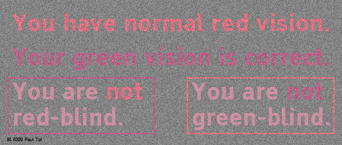
You can use this fancy image to get a rough estimate if you are colorblind or not in some way, too. If you suddenly can’t see something here, congrats! You found out via an image provided by SRON Netherlands Institute for Space Research. Myself, I found out via a meme with an obscenity written in that I could not read without someone else’s help. Tough!
The color wheel is a fundamental tool used by artists, designers, and scientists to understand how colors relate to one another.
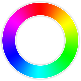
Big thanks to colorsontheweb.com for this one.
The origins of the color wheel date back to Sir Isaac Newton, who in 1666 discovered that light can be broken down into its component colors. He identified seven colors in the visible spectrum: red, orange, yellow, green, blue, indigo, and violet. Later on, this spectrum was condensed to the six colors we know today: red, orange, yellow, green, blue, and purple.
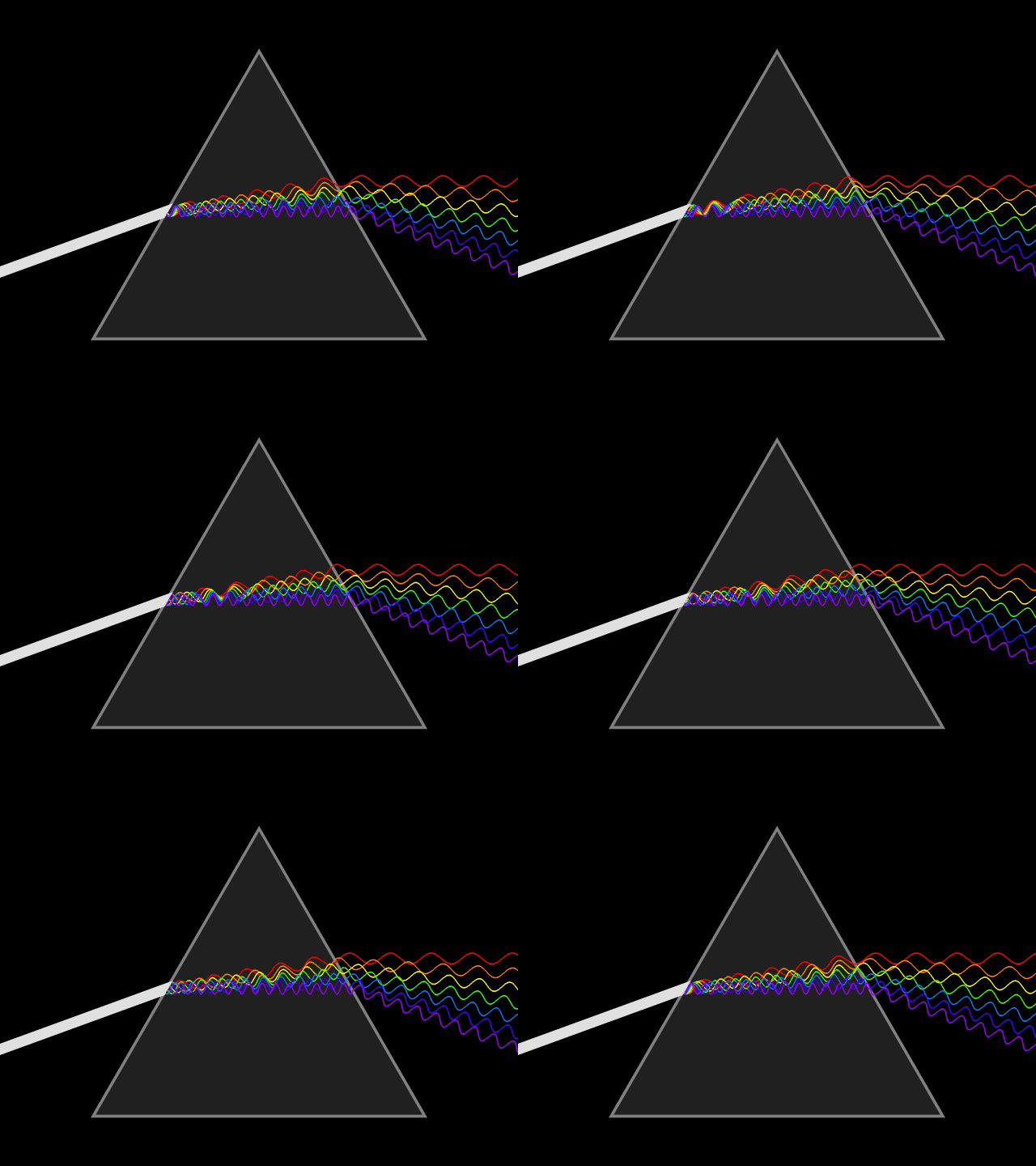
Big thanks to Wikipedia for this amazing gif. So mesmerizing…
The color wheel is a circular diagram that organizes colors in a logical way. It starts with the three primary colors: red, blue, and yellow. These colors are called primary because they cannot be created by mixing other colors. They are the building blocks of all other colors.
Next up are the secondary colors: green, orange, and purple. These colors are created by mixing two primary colors together. For example, mixing blue and yellow creates green, while mixing red and yellow creates orange.
Finally, we have the tertiary colors. These colors are created by mixing a primary and a secondary color together. Examples of tertiary color combinations include red-orange, yellow-green, and blue-purple.
One of the most interesting things about the color wheel is how it can be used to create visually pleasing color schemes. There are several different color schemes that artists and designers use to create their works of art. Some of the most popular include complementary colors, analogous colors, and triadic colors.
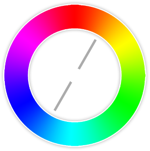
Complementary colors are pairs of colors that are opposite each other on the color wheel. These colors create a strong contrast when used together, making them perfect for creating vibrant designs. The most common complementary pairs are red and green, blue and orange, and yellow and purple.
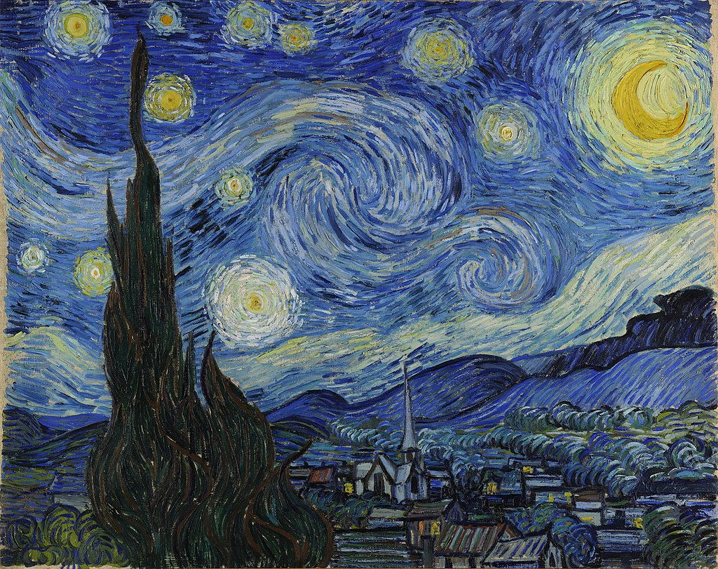
Speaking of blue and orange. Van Gogh’s “Starry Night”. Classic!
The concept of complementary colors dates back to the early 18th century. French painter Michel Eugène Chevreul, who was also a scientist, discovered that when complementary colors were placed side by side, they appeared brighter and more vibrant. This effect is known as simultaneous contrast.
When we stare at a complementary color for a long period of time and then shift our gaze to a white surface, we see an afterimage in the complementary color. Our eyes contain cells that are responsible for detecting color, and when we stare at a certain color for a long time, these cells become fatigued. When we then shift our gaze to a white surface, the fatigued cells respond more weakly than the non-fatigued cells, causing an afterimage to appear in the complementary color.
Complementary colors can also be used to create optical illusions. For instance, if you stare at a yellow square for a few seconds and then look at a white surface, you'll see a blue square. This is because yellow and blue are complementary colors, and staring at the yellow square causes the cells that detect yellow to become tired, making the blue cells more responsive.
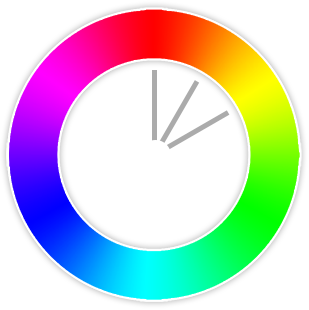
…and this one too.
Analogous colors are colors that are next to each other on the color wheel. When we use analogous colors together, they create a sense of unity and balance. This is why analogous color schemes are often used in graphic design.
Imagine you're designing a room in your house, and you want to create a warm and inviting atmosphere. You might choose an analogous color scheme of red, orange, and yellow. These colors are next to each other on the color wheel and create a sense of warmth and coziness. On the other hand, if you want a cooler and more relaxing atmosphere, you might choose a color scheme of blue, green, and purple, which are also analogous colors.
Let's take the Instagram app as an example. It primarily uses analogous colors of orange, pink, and red. These colors create a warm and inviting atmosphere and reinforce the brand identity and personality of the app, which is all about sharing creative visuals.
Now, it's important to note that while analogous colors create a sense of harmony, they can also be a bit boring if overused. That's why it's important to add in some contrast with complementary colors or neutrals to make your design pop.
…and this one also.
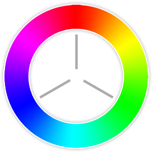
Triadic colors are groups of three colors that are evenly spaced around the color wheel. When you use triadic colors together, they create a sense of balance and harmony, while also adding some excitement and contrast.
So, how do you find triadic colors on the color wheel? It's actually quite simple! You start by selecting one color, and then draw an equilateral triangle around the color wheel, with the corners of the triangle being the two other colors in the triadic group (like in the picture above). For example, if you start with blue, the other two colors in the triadic group would be red and yellow.
Now, you might be thinking, "That sounds like a lot of colors to use in a design!". You don't have to use all three colors in equal amounts. You can use one color as the dominant color, and then use the other two as accents or highlights. This will create a sense of depth and interest in your design.
While triadic colors can be visually striking, they can also be overwhelming if overused. That's why it's important to use them in moderation, and balance them out with neutral colors or complementary colors.
With every year, the trends shift. As you can see at the very beginning of this colorful article, things are always in motion. One thing is certain: colors may become less or more trendy, but they stay the same. Some combinations will always win, depending on what you want to do. Let’s take a look at the winners for 2023:
In a sea of bland, muted websites, a burst of bold color can be just the thing to catch a visitor's eye and keep them engaged. Plus, vibrant colors can help convey a sense of energy and excitement, which is especially important for sites that want to make a bold statement.
As with any design element, there are some things to keep in mind when using bold and vibrant colors. First and foremost, you want to make sure your color choices align with your brand and the overall message you're trying to convey. While it's great to use bold colors, you also want to be mindful of creating a balanced color scheme that's pleasing to the eye. Too much of a good thing can quickly become overwhelming, so use your colors strategically.
To provide an example, the Refinery29 website is a stunning showcase of bold and vibrant colors that truly capture the brand's fun, youthful, and fashion-forward vibe. From the bright pink accents to the bold pops of green and yellow, every element of the site is carefully crafted to create a visually stunning experience that draws you in and keeps you engaged.
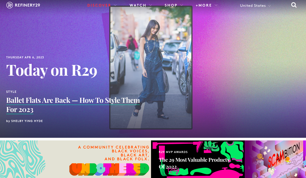
Refinery29 also uses typography and photography to create a visually appealing design. The result is a website that's not only functional but also a joy to look at.
Why would anyone want to use calm and minimalistic colors? Isn't that kind of boring?
Sometimes less is more.
When we talk about calm and minimalistic colors, we're thinking of a palette of soft, muted hues, such as pastels, grays, and earth tones. These colors are often used in conjunction with a simple, clean design aesthetic, which creates a sense of serenity and tranquility on the website.
So, why might you consider using calm and minimalistic colors in your web design? For starters, they can help create a more sophisticated and timeless look, which is especially important for brands that want to convey a sense of elegance and refinement. These colors can help reduce visual clutter and create a more calming user experience, which can be especially valuable for sites that deal with sensitive or emotional topics.
But as with any design trend, there are some potential pitfalls to keep in mind. For example, it can be easy to fall into the trap of creating a website that's too sterile or monochromatic, which can make it feel cold and uninviting. That's why it's important to use your minimalistic color palette in combination with other design elements, such as typography, imagery, and white space, to create a balanced and engaging user experience.
MUJI is known for its clean and simple aesthetic, and its website is no exception. The site features a soothing color palette of muted grays, whites, and earth tones, which creates a sense of serenity and tranquility. The colors are used sparingly, with ample white space to create a clean and uncluttered look.

MUJI's website is also designed with a focus on functionality. The navigation is intuitive and the product pages are clean. A lot of websites out there could take notice!
As you may know, our planet is home to a vast array of breathtaking landscapes and diverse ecosystems, and using natural colors in web design can help capture some of that beauty and bring it to life on the screen.
Browns, greens, blues, and yellows. These colors are often used in conjunction with organic shapes and textures, such as wood grain or foliage, to create a sense of connection to the natural world.
Earthy and natural colors can help you create a more authentic and organic feel, which can be especially valuable for brands that want to convey a sense of sustainability, health, or eco-friendliness. These colors can also foster a calming user experience, which can be especially valuable for sites that deal with wellness, mindfulness, or outdoor activities.
However, it can be easy to go overboard with the natural elements and create a website that feels too busy or cluttered. That's why you should keep your earthy colors in combination with other design elements, such as typography, white space, and imagery, to create a balanced picture.
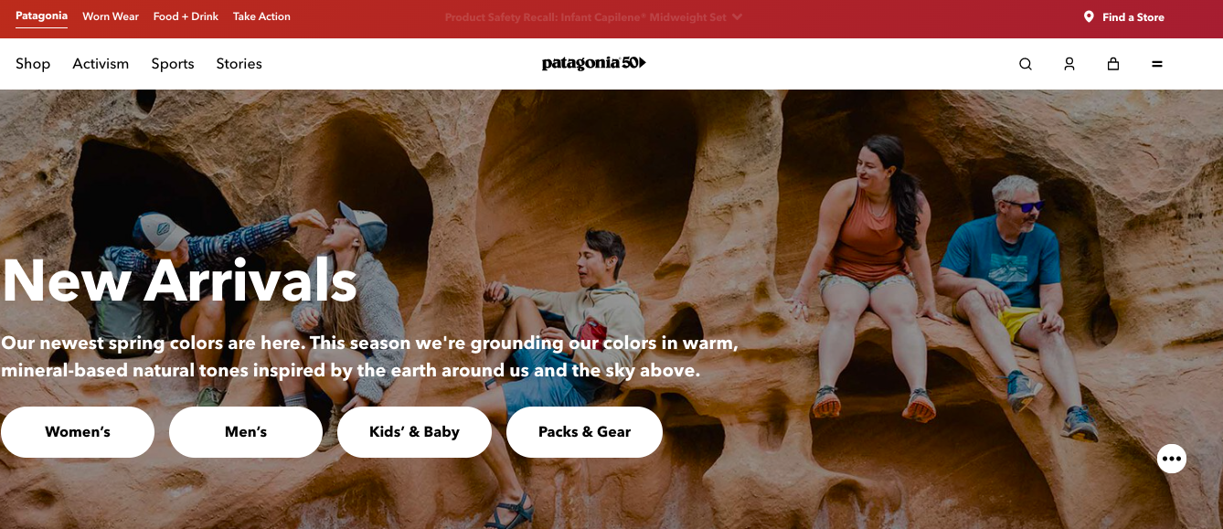
Patagonia, the outdoor clothing and gear company, is a fantastic example of earthy colors in web design. Their website features a palette of muted greens, blues, and browns that are evocative of the natural landscapes they seek to protect.
One thing we particularly appreciate about Patagonia's use of earthy and natural colors is how well they work in conjunction with their typography and layout. The site is easy to navigate and the typography is clear and legible, which helps create a sense of balance and hierarchy on the page.
A monochromatic color scheme involves using different shades and tints of a single color, such as various shades of blue, green, or gray. This approach can create a sense of harmony and unity on the page, while also allowing for a greater focus on typography, imagery, and other design elements.
A monochromatic color scheme is a great way to create a modern aesthetic that feels intentional. It can also simplify the design process by limiting your color choices and allowing you to focus on other design elements.
Be wary of a monochromatic design that feels too flat or lacking in contrast. That's why it's important to experiment with different shades and tints of your chosen color, as well as incorporate other design elements, such as textures or patterns, to create visual interest.
One great example of monochromatic colors in web design is the website of the luxury fashion brand, Chanel. The site features a classic black-and-white color scheme, which creates a sense of sophistication and timelessness.
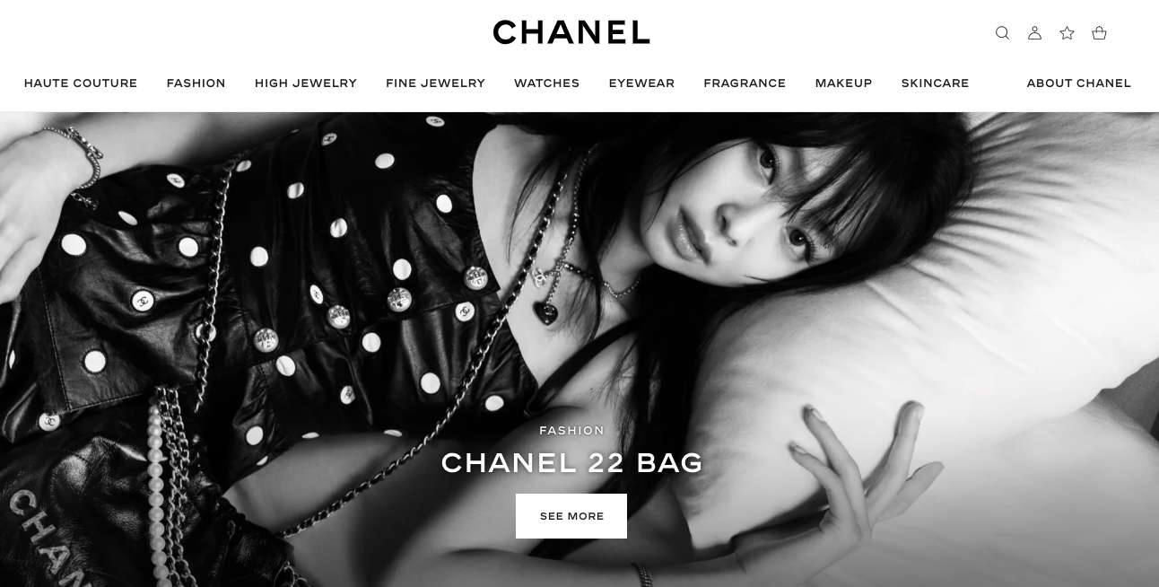
The use of a monochromatic color scheme allows the brand's products to take center stage, while also creating an uncluttered user experience.
When we think about retro and vintage colors, we might picture the psychedelic hues of the 60s or the muted tones of the 70s. These colors can evoke a sense of nostalgia and add a touch of personality to web design. But did you know that there's actual science behind the appeal of these colors?
Color psychology tells us that colors can evoke certain emotions and feelings in people. Retro colors like orange, brown, and olive green can give off a sense of warmth and comfort, while vintage colors like pastel pink and blue can create a feeling of softness and nostalgia. By incorporating these colors into web design, we can create a more inviting and engaging experience for users.
But it's not just about throwing some retro colors onto a website and calling it a day. It's important to use these colors in a way that complements the overall design and brand identity. By combining retro colors with modern design elements, we can create a unique and visually appealing aesthetic that stands out from the crowd.
Whether you're looking to add a touch of that to your website or just want to experiment with some groovy colors, don't be afraid to dive into the world of retro and vintage colors in web design. Who knows, you might just create something truly outta sight!
A fantastic example of a website that uses retro and vintage colors in web design is the website for the California-based company, Stutterheim.
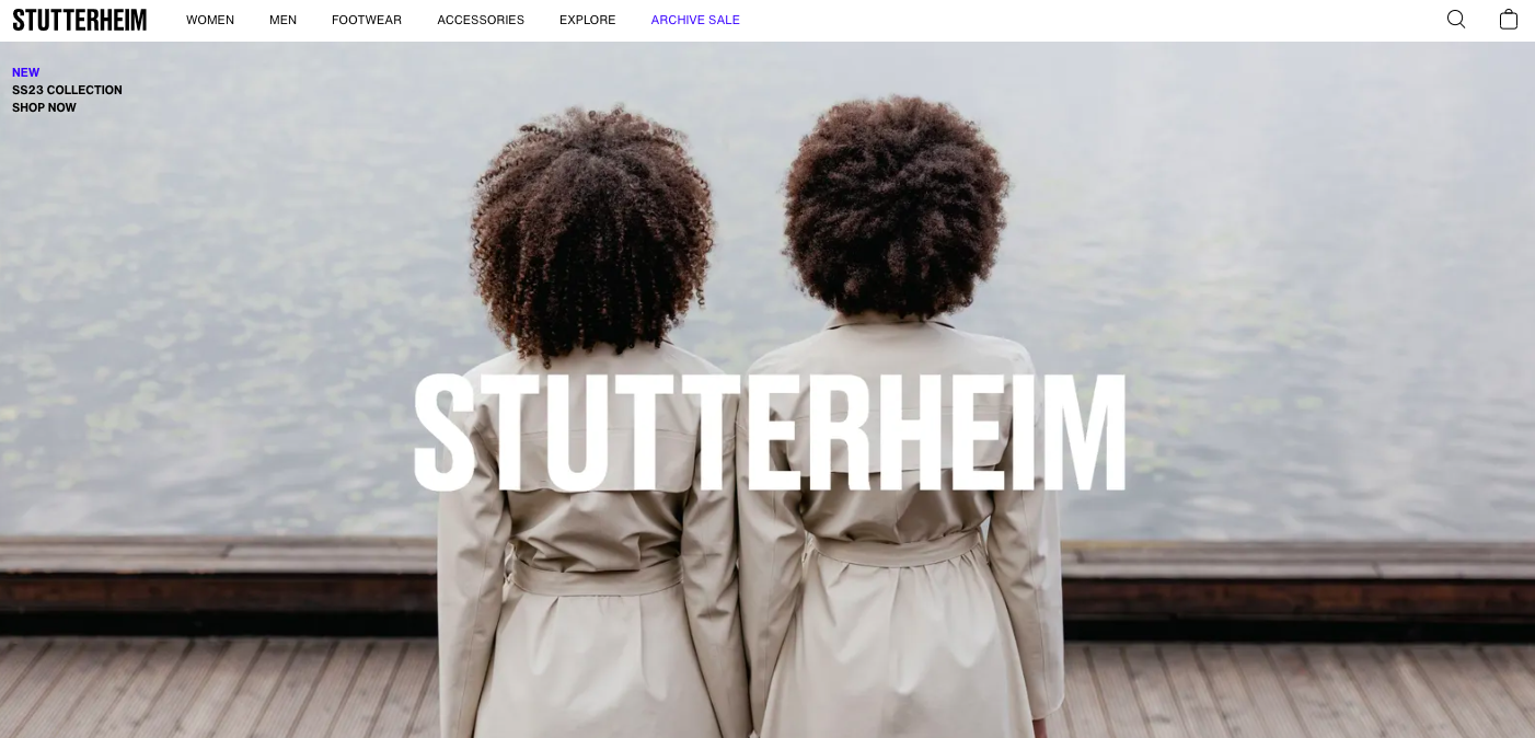
The website uses a muted color scheme with shades of pale green, blue, and grey to create a calming and nostalgic atmosphere. These colors perfectly complement the brand's identity as a high-quality rainwear company with a focus on sustainability and simplicity.
When it comes to selecting colors for your project, there are a few things to keep in mind. First and foremost, you need to consider the purpose of your project. Are you designing a website for a law firm or a bakery? The colors you choose will be vastly different depending on the industry.
Next, think about your target audience. Who are you trying to reach with your project? Are they young and trendy or more mature and sophisticated? The colors you choose should appeal to your target audience and reflect their preferences.
Different industries often have their own color palettes that are associated with them. For example, the healthcare industry often uses blues and greens to convey a sense of calm and trust. On the other hand, the food and beverage industry often uses reds and yellows to create a sense of excitement and hunger.
We would list a whole lot, but there is little point to it. Here’s the one and only you’ll ever need: paletton.com. This is the simplest and most effective color scheme design tool you may need. It has the color combination presets we talked about earlier, too!
Meh? Okay, maybe a few more.
You might want to try Adobe Color as well. It’s highly customizable, and if there’s one company that knows a lot about color in web design, that’s Adobe. Not a fan of the pricing strategy for most tools, but this one is free! A real oddity.
Another option is colormind.io. This tool is AI-based, meaning it has trained on a lot of data to produce the best possible color combinations. Just provide it with the input color you think to start with, and it’ll do the rest for you.
Finally, you can try Palx. Super simple, but even more web designer-friendly as opposed to Paletton.
For the latest happenings in the world of web design and UX, try UX Collective. It’s not a strictly color design community, but you will find out a lot about the impact of color on your users.
And back to us! Directual offers a lot of customization options where you can exercise your new color-picking proficiency.
To customize a web page or pick a template for your Directual project, all you have to do is head to the Web pages section, click Edit portal settings, and choose Appearance.
The appearance tab has a whole bunch of pre-made templates you can use, with every single element customizable. There are dark themes and light themes as well to choose from if you want a quick start.
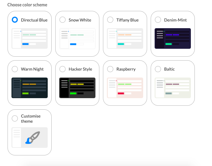
Do note: the icon/logo used must be adapted to the color scheme manually, as it’s a separate picture. Common sense, but worth mentioning.
You can also customize the templates however you want. To do so, just click Customize theme and you’ll have all the options for each element available. See the hex codes for each one? Head to one of the color pickers above, prepare the color scheme based on your desired design and copy-paste it in.
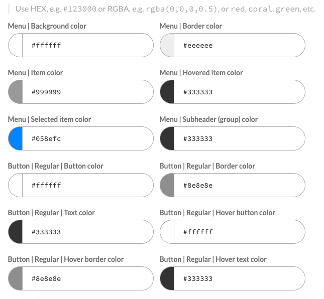
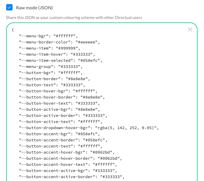
You can also save the color scheme and use it in other projects. It can be done by clicking Raw mode button and copying the JSON code. Store it for other projects, and share it with colleagues or friends, the world’s your oyster.
In case you’d like to learn more about Directual’s web page builder and how it works, we’ve got a complete walkthrough (that is one of the tutorials from the no-code academy) of each element of it, including the topic mentioned above.
Now that you know how to use JSON to copy and share color schemes, we want to share a couple of exclusive color schemes with you.

How about that? Looking good! Live demos: Bondi beach and Rosso Corsa

This is the color scheme used by Ferrari, truly a dashing combination that is both elegant and bold. Want to try it with your own project? Here’s the code:
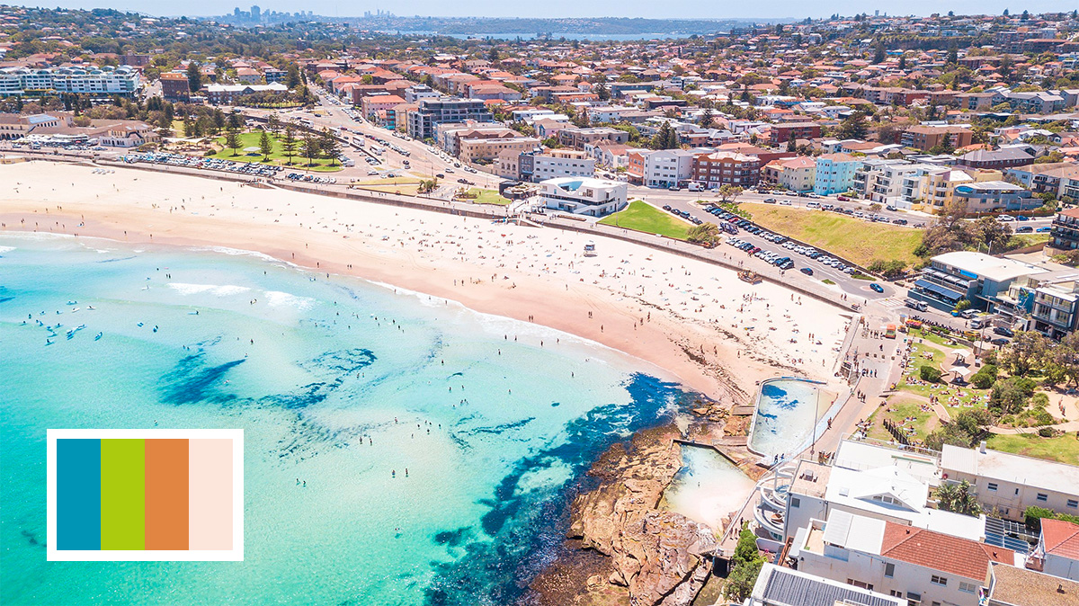
This majestic deep blue color is named after the shade of blue you can encounter in the waters at the beaches of Bondi, Australia. Why don’t we make the color scheme a real holiday treat, and spice it up with some sand yellow and lush palm green?
Many more color schemes to come, or perhaps you will create your own for the users of Directual to see and, perhaps, purchase?
From choosing the right color schemes to using the best tools for color picking, there are a lot of factors to consider. First and foremost, you must always be certain of the very essence your product is trying to convey. Is it calm, or comforting, or something else? From there, you can start picking the colors that will work with it the best.
Doing so is even easier when you’re building your project with no-code. Directual’s range of pre-designed templates can help you kickstart your project and create a beautiful design for your brand identity and message. You don't need to be a design expert to create a professional-looking web project or app.
Want to learn more about how it’s done with Directual? Send us a message to hello@directual.com, or better yet, hop into our Facebook, Discord, and Telegram communities—the links are in the footer below.