


Solutions
Who uses Directual and why?


What can be built on the platform?


What industries benefit from Directual?


🇬🇧


Responsive web design is a must these days. This comprehensive guide aims to unravel some of the secrets of responsive web design, exploring its meaning, components, implementation, and integration with no-code solutions such as Directual. So, go get a coffee, no-coder, we have a topic to discuss.

Responsive web design, or simply RWD, has become essential in today's digital landscape, largely due to the surge in mobile traffic. As smartphones and tablets become the primary means of accessing the Internet, websites must adapt to different devices and screen sizes.
This need is driven by the expectation that websites will seamlessly adapt their layout and content to provide an optimal user experience. The emphasis on adaptability goes beyond user satisfaction; it is integral to maintaining visibility and ranking in search engine results. Search engines like Google prioritize mobile-friendly websites, making responsive design a key factor in a successful online presence.

RWD is an approach that ensures websites seamlessly adapt to the varying screen sizes and resolutions of different devices. This adaptability is achieved through the use of flexible layouts, images, and CSS media queries, providing users with an optimal viewing experience regardless of the device they are using.
In contrast, adaptive web design, or simply AWD, involves the creation of multiple versions of a website tailored to specific devices and lacks the fluidity and dynamic responsiveness inherent in the responsive design paradigm.
Here is a table to help you understand the difference in approach between RWD and AWD.
Responsive design matters a lot because it ensures a seamless user experience across devices by effortlessly adapting to the screens of smartphones, tablets, laptops, and desktops. This adaptability eliminates the hassle of excessive zooming or scrolling, ensuring that users have an optimized experience.
In addition to user satisfaction, responsive design plays an important role in search engine optimization (SEO). Search engines, especially Google, prioritize sites that are mobile friendly, resulting in higher rankings and increased visibility in search results. Statistically, mobile devices are now a significant contributor to global web traffic. In particular, websites with responsive design have higher conversion rates on mobile devices than their non-responsive counterparts.
When choosing a responsive theme, thorough cross-device testing is essential to ensure functionality across platforms. Look for themes that prioritize performance optimization, scalability for future growth, and user-friendly features for seamless customization and interaction.
Here are some general tips to help you choose a responsive theme:

There are several key components to responsive web design that work together to create a seamless user experience across a variety of devices:
Here is a list with the most important components and what they are responsible for:
Implementing responsive design requires a systematic approach. Start with a mobile-first design strategy that prioritizes the smallest screen sizes. Use media queries to set breakpoints for different devices and adjust layout and content accordingly.
Here is a step-by-step guide with code samples and best practices:
1. Understand the basics: Familiarize yourself with HTML and CSS fundamentals. Ensure your HTML is structured logically, and your CSS is well-organized.
2. Use viewport meta tag: Include the viewport meta tag in the ‘<head>’of your HTML document to control the viewport's width and scale on different devices.
3. Mobile-first approach: Start your design with the smallest screen size and then progressively enhance it for larger screens. This ensures a solid foundation for mobile users.
4. Create fluid layouts: Use relative units like percentages for layout elements instead of fixed units like pixels. This allows the layout to adapt to different screen sizes.
5. Implement media queries: Apply media queries to adjust styles based on device characteristics. Set breakpoints to optimize styles for specific screen sizes.
6. Responsive images: Use the max-width property to ensure images scale down on smaller screens.
7. Flexbox for layouts: Utilize Flexbox for flexible and efficient layout design.
8. Test across devices: Regularly test your website on different devices and browsers to ensure a consistent and optimized experience.
9. Optimize typography: Use relative units for fonts (‘em’, ‘rem’) to ensure readability on various screen sizes.
10. Consider touch interactions: Design touch-friendly elements, like buttons with adequate spacing, for an improved mobile experience.
11. Set breakpoints and common screen sizes: Determine breakpoints based on common screen sizes. For example:
12. Use frameworks (optional): Consider using CSS frameworks like Bootstrap or Flexbox Grid for a quicker start, but be cautious not to over-rely on pre-built solutions.
13. Optimize performance: Compress images, minify CSS and JavaScript, and leverage browser caching for faster loading times.
By following these steps, such as starting with mobile design, setting breakpoints, and using best practices, you can create a website that works well across devices and screen sizes. Testing and making improvements on a regular basis is important to keep your site running smoothly.
As mentioned above, RWD is a big deal. It's widely used across industries to ensure a seamless user experience across devices.
Let's take a closer look at some of the companies that I think are setting the bar and what they are doing right and wrong in terms of RWD.
What Tesla does right:
Areas for improvement:
What Netflix does right:
Areas for improvement:
No-code platforms typically offer intuitive, drag-and-drop interfaces that allow users to design and deploy responsive websites without learning coding. Directual, in particular, streamlines the process by providing an easy-to-use environment where you can visually build websites, incorporating responsive design principles effortlessly.

Directual also offers a wide range of easy-to-implement customization options:
For those who may not have extensive coding skills, no-code platforms provide an accessible way to participate in the creation of responsive web designs. By eliminating the need for manual coding, these platforms democratize web development, allowing a broader audience to participate in the creation of digital experiences.
In conclusion, whether you code or use no-code solutions, the principles of responsive design are your companion in creating websites that adapt seamlessly and engage users across devices. The user experience, SEO benefits and adaptability underline its importance.
Start implementing these general recommendations today and see how they transform your website performance, user engagement, and overall digital success. If you still have questions, be sure to join our no-code community and let’s talk! You can also send us a message at hello@directual.com.
The main difference between responsive and adaptive web design is how they handle different screen sizes. Responsive design uses a single, flexible layout for all devices, adjusting elements based on screen width. Adaptive design, on the other hand, creates multiple versions of a site, each tailored to specific device categories. Responsive design is more fluid and dynamic, while adaptive design provides a more targeted, device-specific experience.
Media queries in CSS enable responsive design by conditionally applying styles based on characteristics such as screen width, height, or device characteristics. Developers use media queries to adapt the layout and styling of a website for different devices and screen sizes, ensuring a seamless user experience across platforms.
Common breakpoints for responsive design typically align with standard device screen sizes. Common breakpoints include: Small devices (phones): 576px and below; Medium devices (tablets): 576px to 768px; Large devices (desktops): 769px to 992px; Extra-large devices (large desktops): 993px and above.
Yes, you can create a responsive website without coding skills by using no-code or low-code website builders. These platforms typically offer intuitive, drag-and-drop interfaces that allow you to design and deploy responsive websites without the need for manual coding.
The HTML structure influences the responsiveness of a website by organizing content and defining the document's logical structure. Proper HTML structure, combined with CSS and media queries, ensures a flexible layout that adapts seamlessly to various screen sizes, enhancing the overall responsiveness and user experience of the website.


Anthropic's research (March 2026) shows AI already covers up to 75% of tasks in several occupations, yet real-world usage is just a third of its potential. Youth hiring into exposed roles has slowed by 14% — an early sign the market is shifting. Whoever builds AI agent infrastructure first wins. Directual provides everything you need without code, and its free course gets you started in an hour.

We’re back with the big one. After a stellar reaction last year, we’re doubling down — the same unbeatable deal, extended dates, even more opportunity. From November 17 to November 30, this isn’t a “maybe” — it’s your moment to jump.

While some companies pour millions into flashy ChatGPT demos and get zero results, others are already making millions from AI agents. Why do 95% of corporate AI projects fail — and how can you join the successful 5%? Let’s unpack MIT data, real-world cases, and how agentic systems with memory and learning are changing the rules of the game.

Two mindsets are clashing: the fast-flowing vibe-coding, where AI drives creativity, and the structured low-coding, where control and architecture matter. This article explores how to balance the two.

September’s update brings modal windows, scenario connections, object path viz with shareable URLs, ArrayLink tables, socket redirects, quick app switcher, and chat upgrades — plus plenty of fixes and speed boosts.
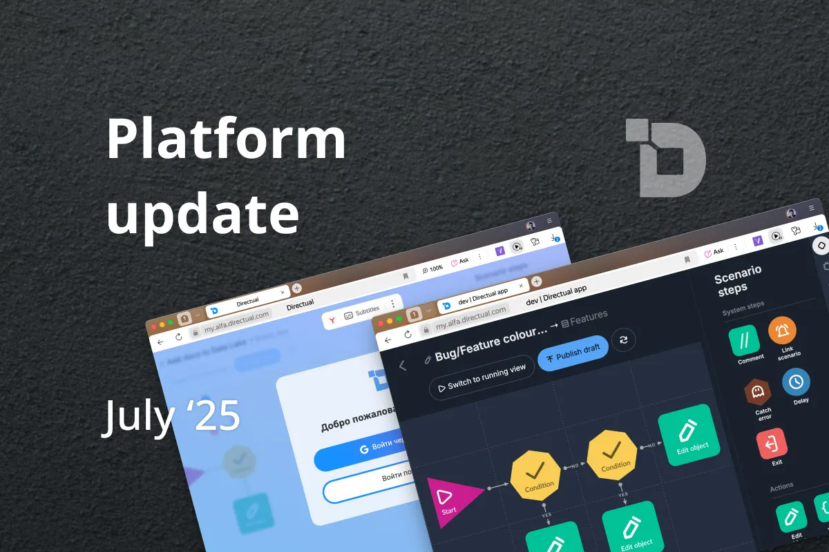
We’ve rolled out an update that transforms everyday work on the platform. This release brings eight-language support, long-awaited Dark Mode, smart copying of steps and sections, new icons, an improved SQL step, and several other handy enhancements.
Join 22,000+ no-coders using Directual and create something you can be proud of—both faster and cheaper than ever before. It’s easy to start thanks to the visual development UI, and just as easy to scale with powerful, enterprise-grade databases and backend.

